


The first of three pillow toppers, the wild nature of the imagery encompasses the good times that are had at Libertine Social.
The second of three pillow toppers, a fun creative campaign for Libertine Social's 2018 style update is truly represented through the social atmosphere shown here.
The third of three pillow toppers, we've come full circle with a show of the lounge atmosphere, table shenanigans and the overall feel of a true social dining experience.
The imagery in this piece was elegantly placed and provided the exact look and feel that the Mandalay Bay Wedding Chapel desired for their 2017 Open House.
I used a softer touch here to accentuate the feeling of elation. The imagery really pulled it together.
Again, the use of a softer, more elegant font set complimented the imagery so well.
Advertising materials for days. You've got to respect the time it takes to put a DM piece like this together.
Beer. What's not to like there. Plus, these April growlers bring a whole lot of it. It was really nice to have a bit of freedom here with this piece and it turned out exactly how I imagined.
Go, Knights, Go! #GearUpHockeyFans
The final print used a foiling technique for the lime green which went REALLY WELL with the paper material we ended up using for these invitations.
I LOVE OCTOPUS, so of course, I was elated to be a part of this campaign. The 2017 Haunted Reef design was honestly one of my favorites.
The best part about being involved with this Polar Journey 2017 campaign was the fact that we were able to visit the venue to get a better feel for what they were trying to accomplish.
Another major logo design project for me while keeping in tune with the previous year's collateral. We were tasked with keeping the logo as similar to the recent Super Bowl color set, which in turn brought it all together.
There's always room for interpretation. From a basketball turning into the hoop, of course it structured itself well.
This logo was more of a fun piece for me. From the pastel colors to framing it well with the use of the balloons, this was a fun campaign.
Building this piece really allowed our team to give it new life. Stemming from the Santa in the Shipwreck logo buildout and ending with the animal silhouettes.
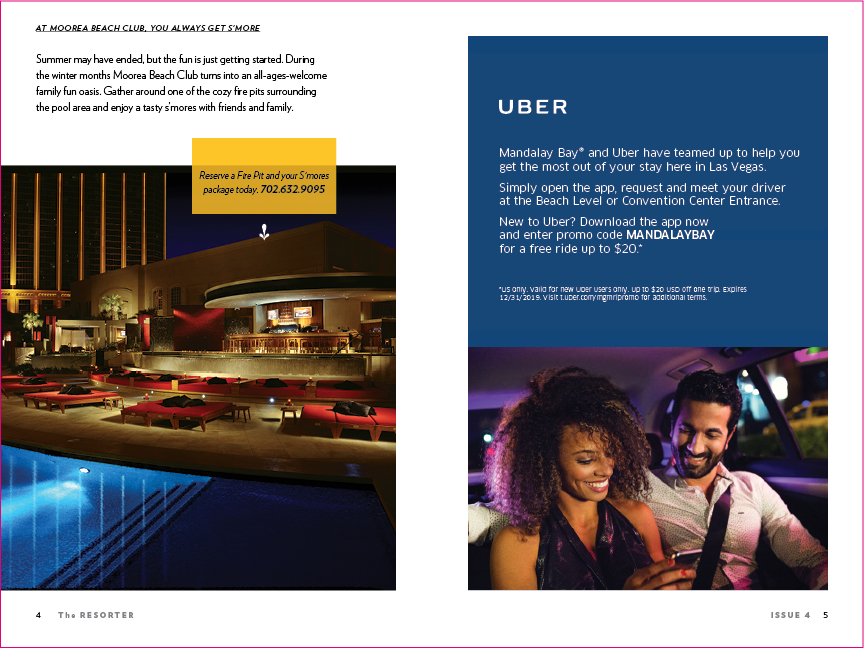
The Resorter is a quarterly in-room item utilized to give an overview of everything Mandalay Bay during that current timeframe.
Yummmmmm. SMORES!!!
This ad space is usually saved for one of the major initiatives/partnerships or events for the year.
The Entertainment space is saved more specifically for the Corporate Entertainment's Calendar of Events and to highlight one of the major entertainment venues at the Mandalay Bay.
This is the Libertine Social Business Card used to promote the newly opened Libertine Social located at the Mandalay Bay Hotel & Casino.
"EAT. DRINK. LIBERATE."
Lastly, there is usually a spread to highlight a Restaurant or Food & Beverage venue on-property as well. 2017 was the year of Libertine Social.
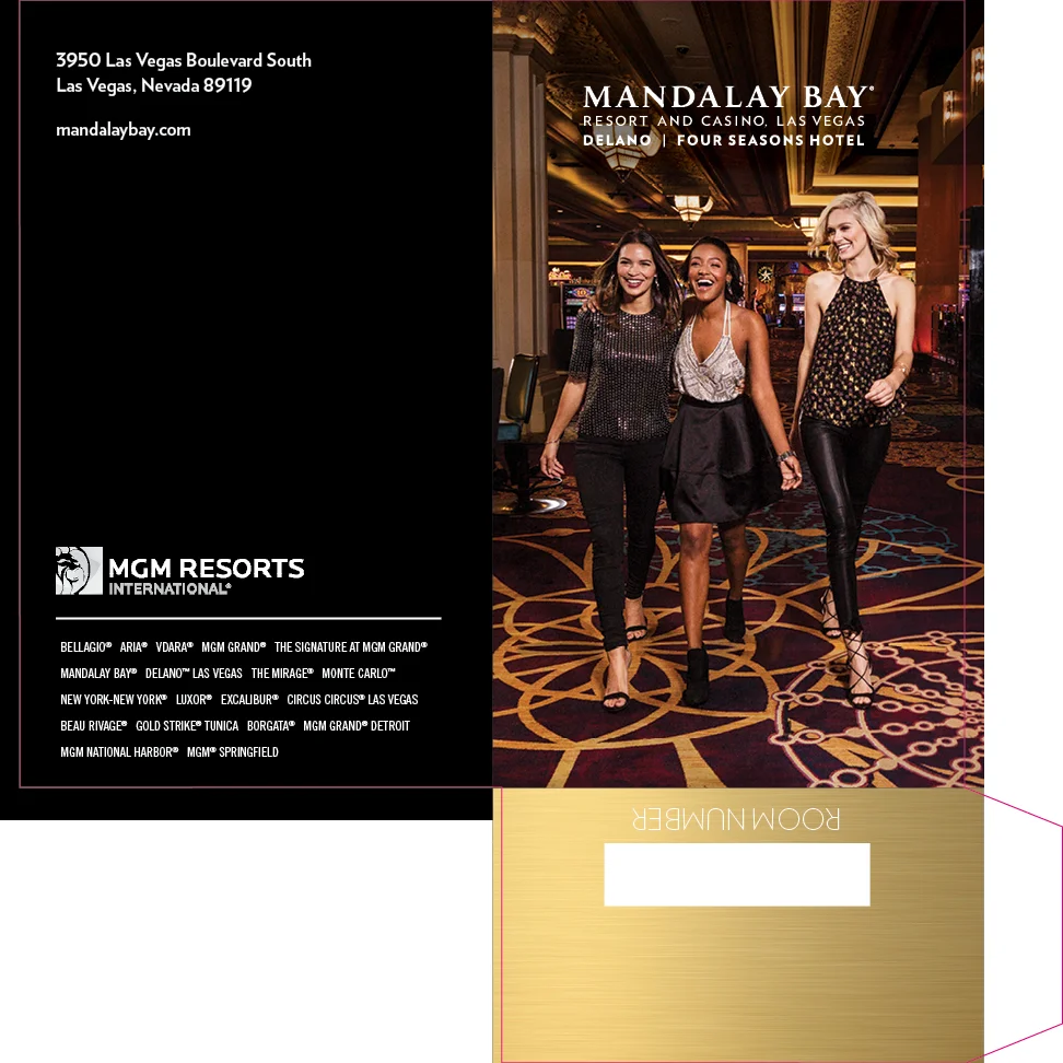
One of many standardized key packets for all MGM Resorts International properties, here we have Mandalay Bay's luxurious design and lifestyle incorporation.
Yet another standardized key packet but this time for the Delano Las Vegas property. Here we have the portrayal of their elegant lobby carpet that represents the Colorado River along with a hanging petrified desert wood mini-sculpture.